Ryan Payne

We decided to completely redesign the home screen and the start screen to fit the application keeping the users and the company’s mission intact. We decided to use a chalkboard background to align with the student mentality. We also decided to use a block style college font because college is the users end goal.
We relied on extensive user testing in the creation of the Word Slam application. We were lucky because it was an application already on the market and had shown some popularity. I decided to leverage the Word Slam community to get their feedback on where the Word Slam application could improve. The feedback was that the app navigation was cumbersome, the colors didn’t align with the user and the users wanted a way to measure their progress.
Word Slam App


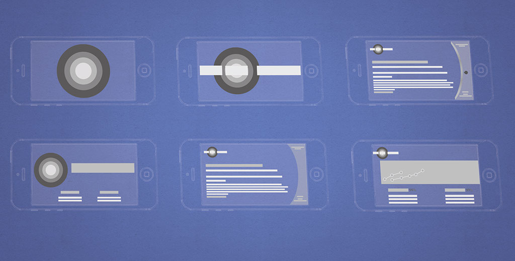
Beginning stages of comps for Word Slam
Early design concepts for Teach Me screen
Early design concepts for the start screen
Home Screen
Teach Me Screen
Test Me Screen
Ranking percentages & progress
4 - 7
<
>
We decided to completely redesign the home screen and the start screen to fit the application keeping the users and the company’s mission intact. We decided to use a chalkboard background to align with the student mentality. We also decided to use a block style college font because college is the users end goal.